Holistic interior design talk with Lou Home designs. By Louise Prieto
Photography: Bianca Wolf and Adobe.
Although we may have a solid notion of the colours we are particularly drawn to, most of us don’t actively consider the reasons behind these decisions. It is also all too easy to let our excitement over trends cloud our perception of the colours with which we truly connect. It may seem apparent when said clearly but take a moment to check in with your emotions and consider how you want those colours to make you feel before committing to any colour choices, whether for decor or anything else.
Most of us are aware of the broad generalisations (blue can calm us; yellow can make us joyful), that colour psychology is a complex subject with many variables at play. Karen Haller, an applied colour psychologist, explains how light entering our eyes produces the production of a chemical transmitter, which in turn affects our minds and emotions: “Colour speaks to us in a language we instinctively understand—the language of emotions—and it influences our behaviour without necessarily being conscious of doing so.”
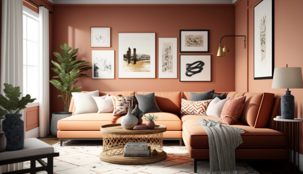
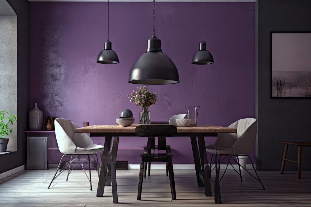
According to research, the wavelength of each colour has an impact on how we perceive it. Shorter wavelength colours, such as warm neutrals, blues, and greens, are easier for our brains to process since they are in the middle of the colour spectrum. As a species, we are bred to choose the easiest route. Longer wavelengths make colours like red, orange, and yellow seem closer to us than they actually are, which can cause a stronger reaction.
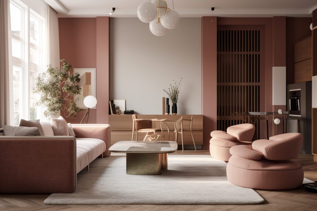
As a result, these colours are often associated with more exciting emotions like passion and excitement or danger and fury.No matter the wavelength, it is generally accepted that the more powerful a tone, the more stimulating its effect will be (for instance, in contrast to the stimulating red, the soothing pink, which is essentially red that has been diluted and combined with white). You can make better design decisions and reduce your chances of creating an unsettling environment by considering wavelength, tonal saturation, and how much of a specific colour you employ.
Anecdote:
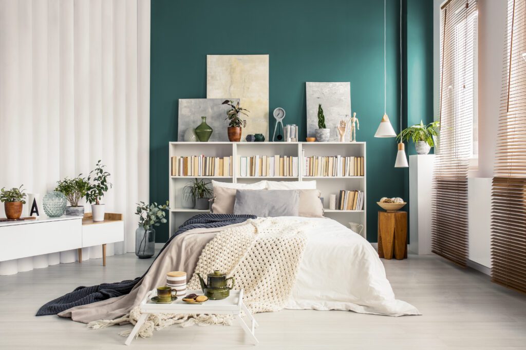
Do you ever have the feeling that pristine, shining white is cold and unforgiving?
That’s perhaps because it’s a completely artificial tint that doesn’t exist in nature, making it difficult to relate too.
Find full article and more details on my website: